


February Things of Note
Colour pops and French villa dreams.

INTERIORS
Cote De Folk
So many lessons to learn from Sophie Rowell of Cote de Folk.
Bold restraint ( now thats a super skill balancing act I’d love to have ). Joyful but serious use of colour and pattern. Totally working outside of trends yet simultaneously being bang on the money.
Photos by snookphotograph
Of note
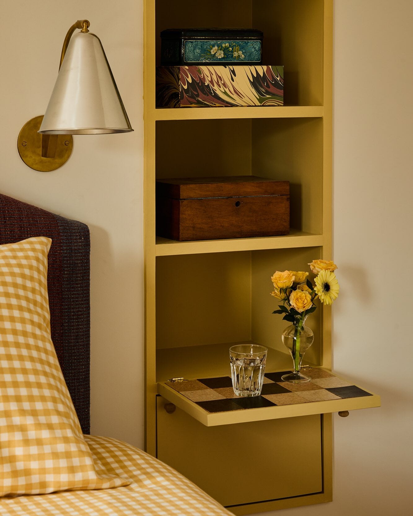
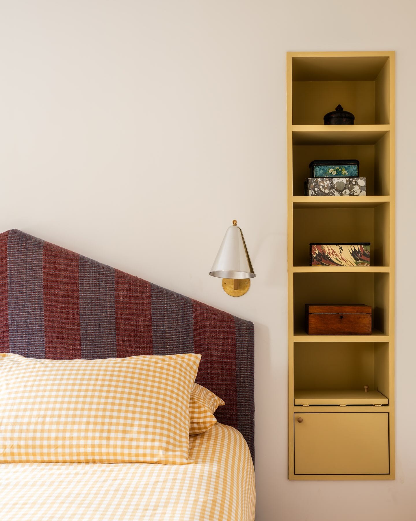
I think peoples fear of colour is the idea of fully colour drenching a room, although in lots of ways that may just be the easiest way to do it. I love that look, but accents can be punchy too, shown perfectly here on the recessed niche shelving. The window frame and radiator in this space are also painted in this lovely ochre yellow hue.
Pulling in similar or complimentary tones into your bed sheets is a nice way to spruce up your space inexpensively and coherently too. Yellow gingham, as used here is definitely spirit lifting and a nice contrasting small pattern with the bold stripes of the headboard.
I used to be a white cotton only person but have really embraced colour in my bedding lately. I allowed myself to go to town with my son’s sheets, combining stripes, small floral’s and ginghams.
I’m not sure what it is about a child’s room that allows you to make the bolder moves you hesitate to make in your ‘adult’ spaces. I definitely need to have more of that energy when approaching other parts of the house.
Last but not least I love the unexpected shape of the head board as well as the ingenious use of cork or perhaps linoleum? on the flip down bedside table, such a practical solution. ( no water stains here)


More delightful pops of colour in the Rainer Daumiller Dining Chairs above. These are sprayed a delicious shade of blue ( again tying in beautifully with the windows) and sourced from one of my favourites for eclectic finds Scene by Chloe.
Although I’m pretty sure you will have all seen the gingham Linolium floor all over the gram, can we just pause to give it some extra appreciation here.
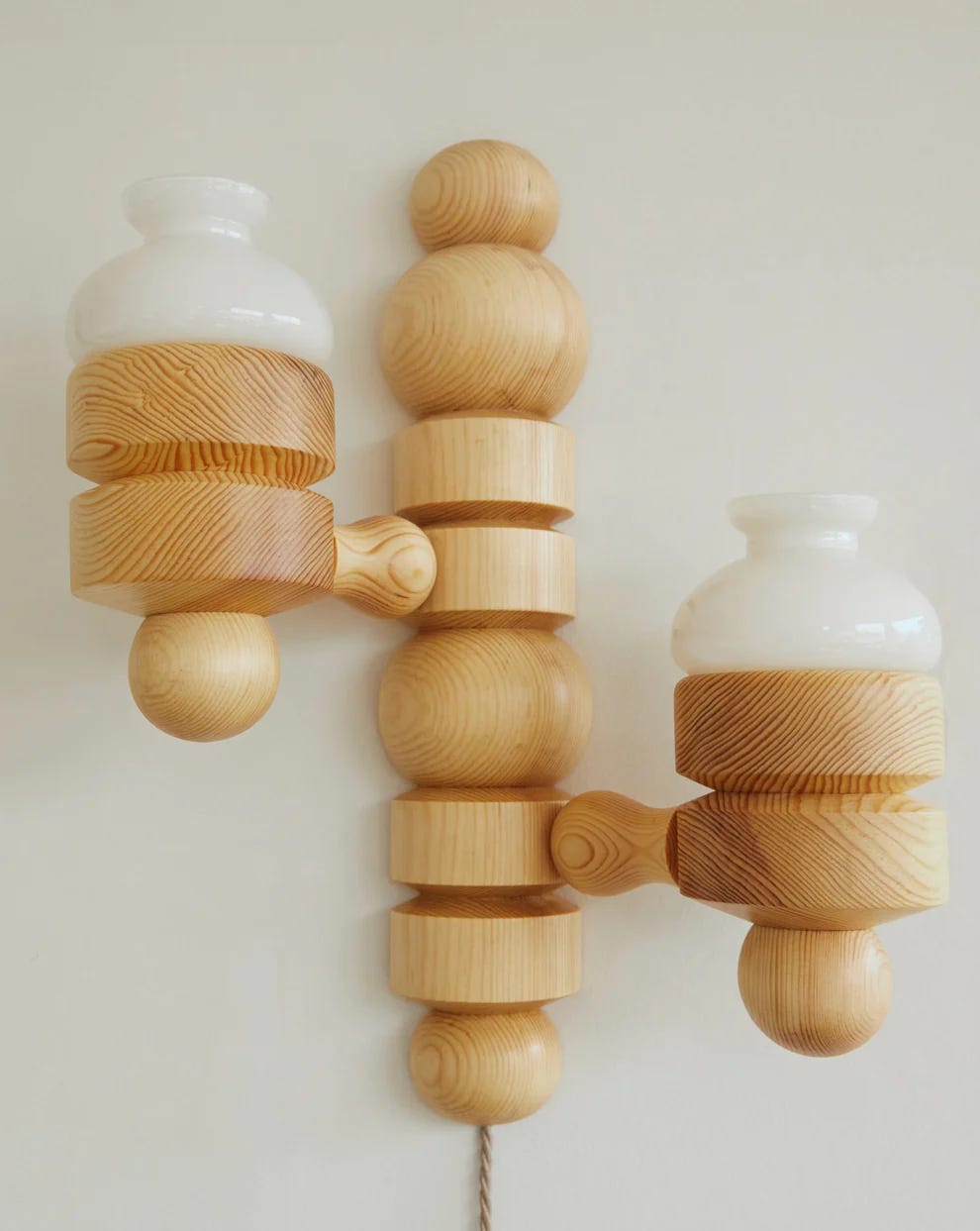
If you are a fan of chunky pine lighting ( as per the wall lights above) but are struggling to source vintage, Passe The Store has a design called Elia that may float your boat. See below.
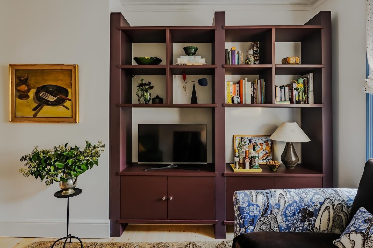
Another expert pop of colour on the cabinetry above. I’m a huge fan of this colour and use it often in my artwork. I just ordered Rose Uniacke’s Aubergine to try on one of my doors which seemed similar. It happened to be too purple toned for me. For something more red toned I like Little Green’s Arras and more in the brown tones Paint and Paper Library’s Scarlett n’ Rust looks great.
Aside from the colour I also love the detailing in this cabinetry with chunky uprights and slim interior shelving. Sophie really is a master of details that elevate.
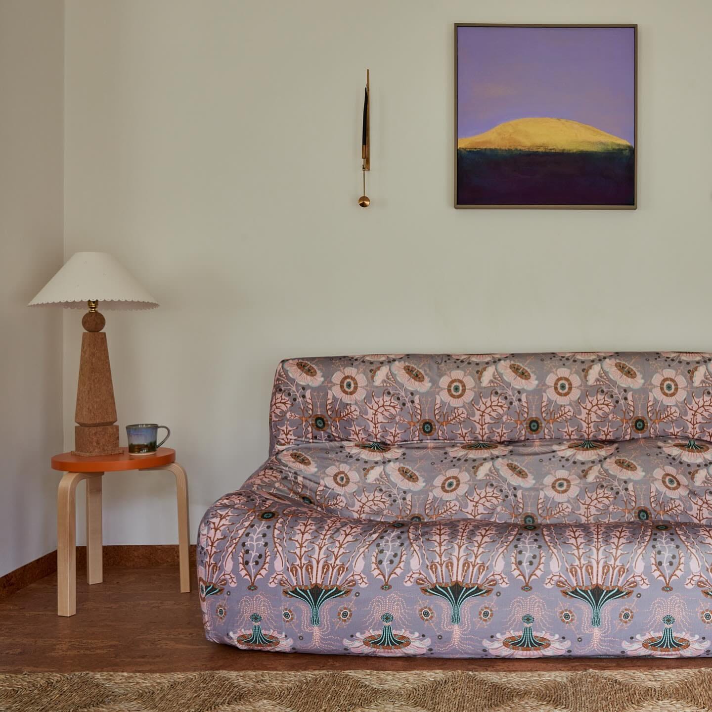
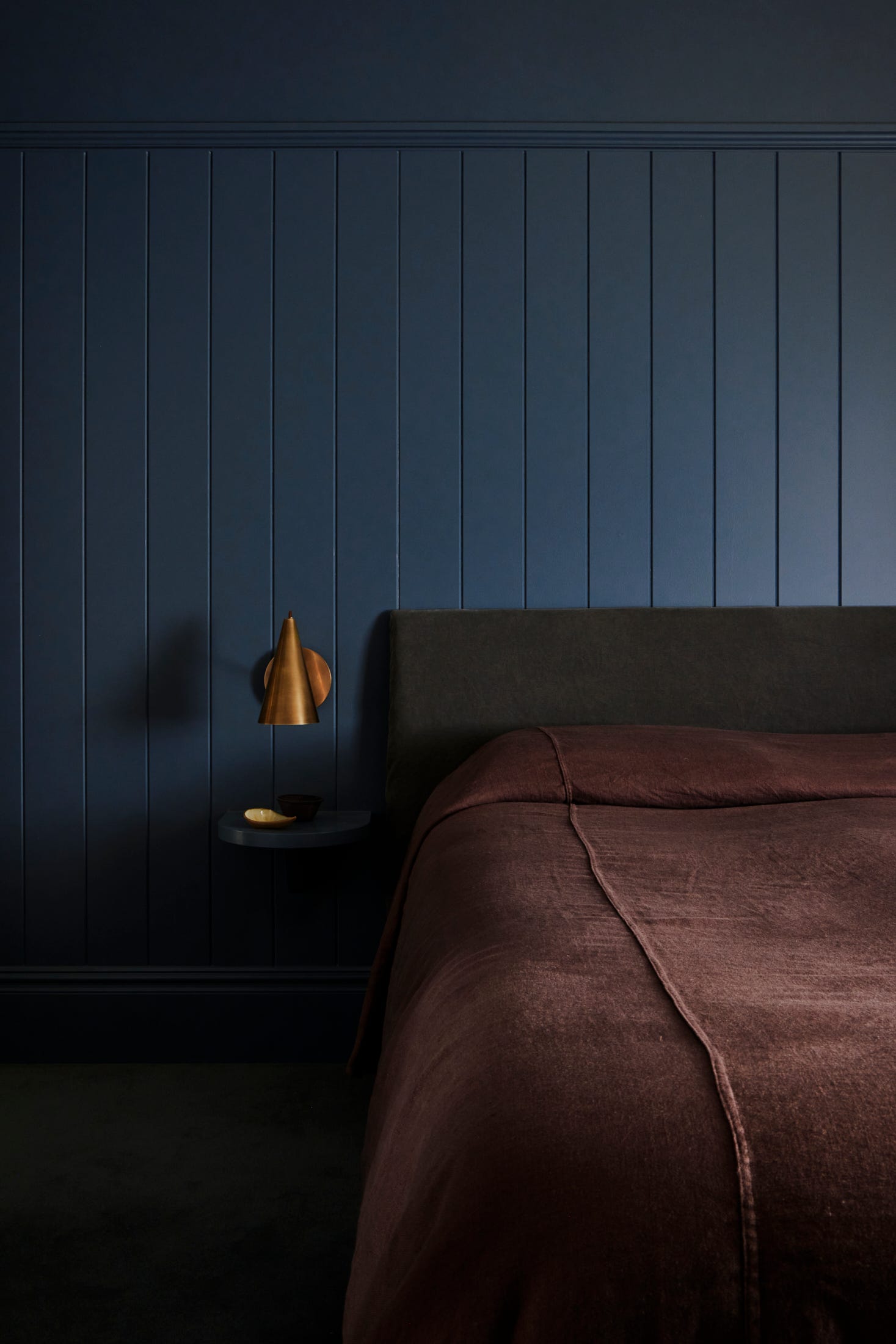
Another huge tick for botanical upholstery on a modernist form. Your nap on here would be soooo satisfying.
INTERIORS
Studio Gemma
I first came across Gemma as one of the most generous sharers on instagram. Little did I know initially that she is also a mega designer.
What I love most about Gemma’s particular brand of sharing is that she drills down into the detail. Its not just look at this eye candy content, its “look at how the designer has used a coloured stain, or a bull nose detail, or chunky grout lines etc etc”. She celebrates the cherry on top and brings to the fore what a designer with expertise contributes to the interior process.
You can explore some imagery from a delightful project Gemma recently shared below ( Photography by Jacqui Turk Styling by Corina Koch ) . Gemma also very kindly took part in a little Q&A below.
Definitely give her a follow @_studiogemma_ if you don’t already. What she doesn’t know about joinery isn’t worth knowing.
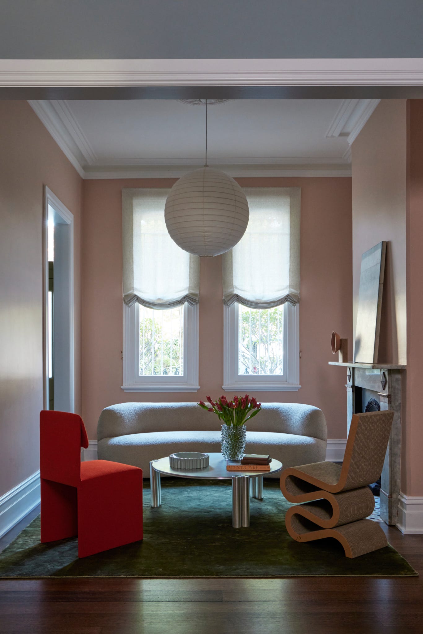
Really enjoying the colour combination above. Red and green are great friends but can look dangerously festive. The dusky pink walls in addition makes sure this isn’t the case. Lots of conversation starter chairs in the whole scheme too. Big fan of the Frank Gehry wiggle in this period building context.

Wiggle Side Chair - if you can make the psychological leap and bear to part with £867.00 for cardboard it’s currently on sale at ARAM
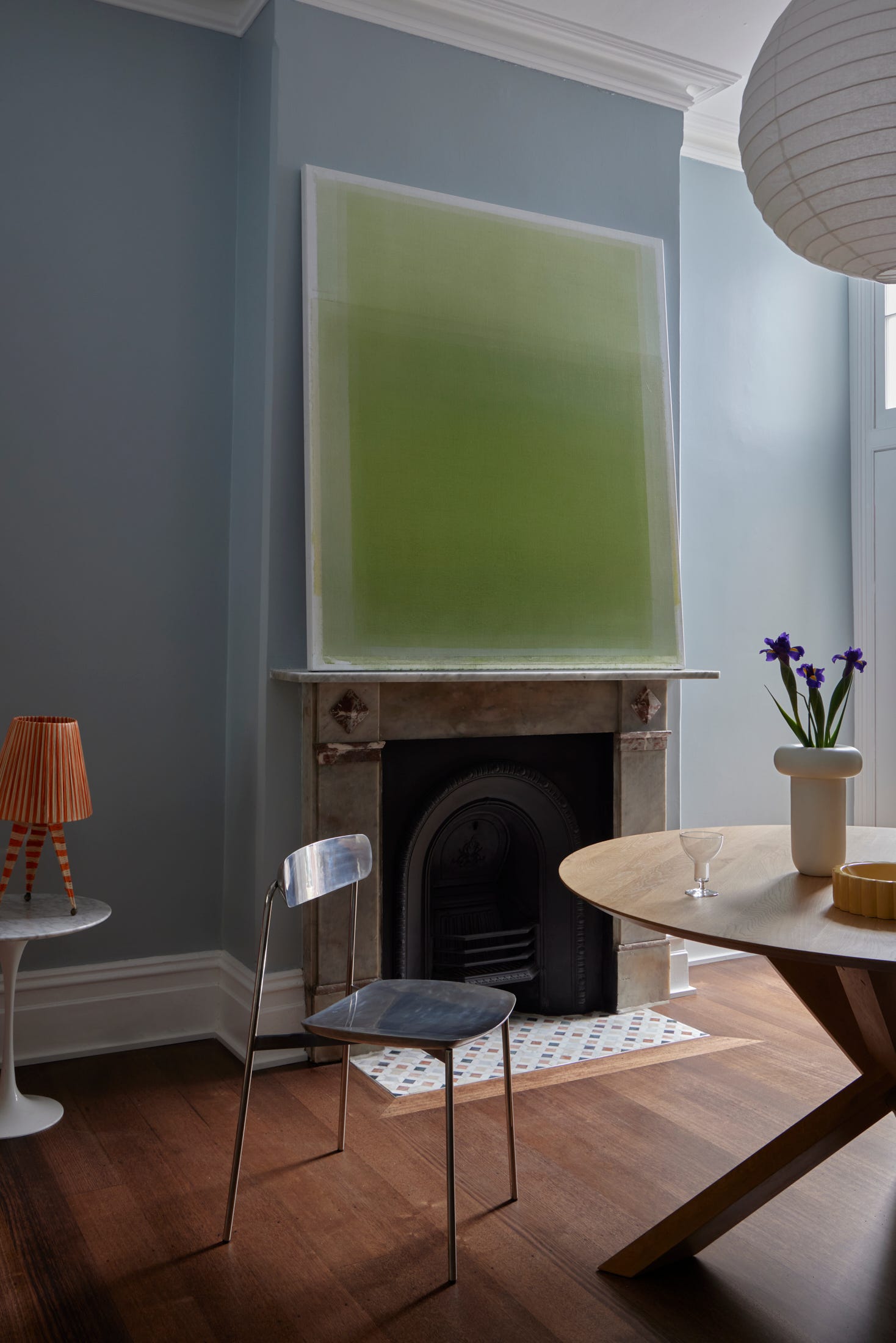
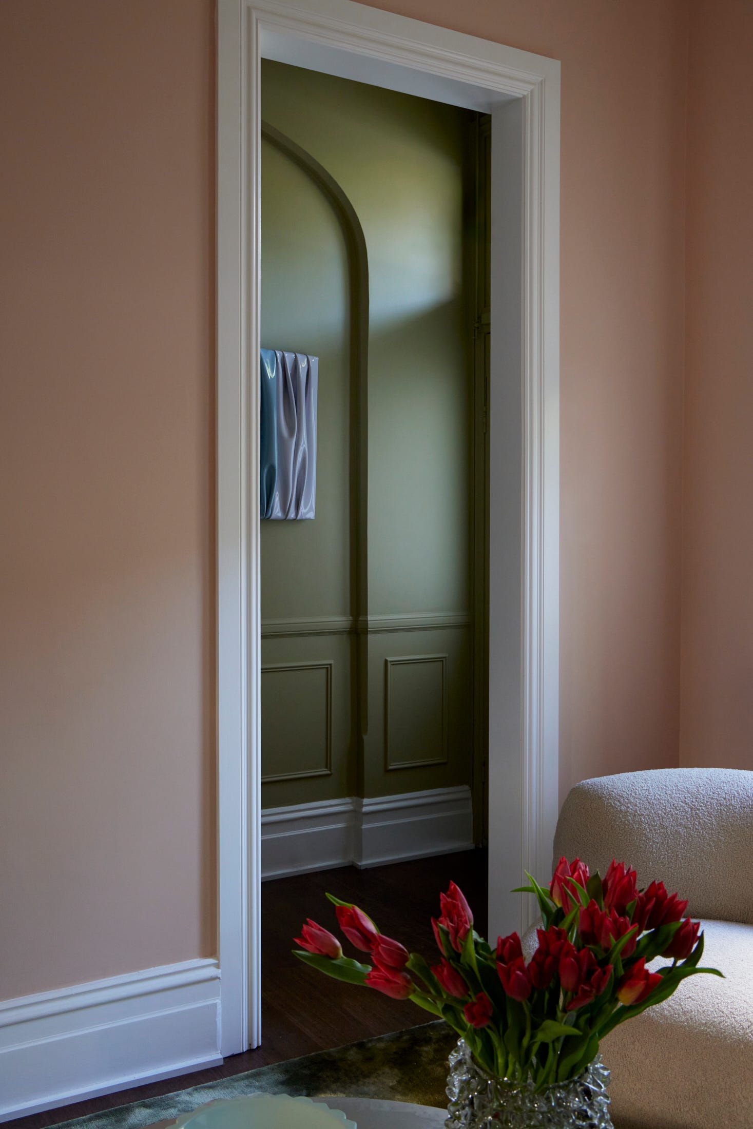
If you have a view through to another space, take a leaf out of Gemma’s book and really consider how the colours will interact together. Pink and green should always be seen, and these tones are perfect. The artwork that you can sneak a peak of looks like the work of Manon Steyaert whose pieces I have had my eye on for a while. Some smaller ones are available on her site.
Studio and Store’s Lucid mirror wall sculptures have a similar material and sculptural quality and would contrast equally well in a period property with traditional details.
More great colour combo’s above. The perfect blue with the deep mustard curtains is an absolute winner. And again, a stand out chair whose materials contrast perfectly with the wood table. If you like the vase, I suspect it may be a DONG vessel by a designer local to me, Kim Thome, available to purchase here
Love Kim’s ELBOW shelf too whilst you are on his site.
….and now for the Q&A with Gemma!
In a past newsletter, I discussed the idea of the 'fly in the ointment' needed in a space for it to sing. Have you recently discovered any objects, furniture or colour combinations that deliver this "wrong but right' feeling?
Ha, this is so true! It's like that quirky armchair you shouldn't like, but for some reason, you love it, and then it completes the space, and you can't quite understand why it works!
I love those bonkers sculptural forms (like this or this), especially when people don't know if it's a seat or a sculpture! I am big for wild decorative hardware, which will divide a nation whether they like it (or not)! I love these—I haven't been able to get them over the line yet on a project, but I will!
You have an amazing amount of resources on your website ‘The Joinery Edit’. What is the most overlooked aspect of design when approaching joinery projects?
Understanding material finishes is critical but often overlooked in joinery design. Most designers leave university with minimal practical knowledge of how different materials perform and compare cost-wise. Many stick to familiar materials without proper mentorship rather than exploring innovative options, impacting creativity and client communication. This expertise gap also affects our ability to brief joiners and confidently justify material choices to clients.
…and which guide do you think would be most useful to novices taking on their first collaboration with a professional joiner?
This guide, The Common Joinery Finishes, is ideal for industry newcomers and renovators. It breaks down "common" joinery finishes and their characteristics, including pricing tiers for easy comparison—essential knowledge for productive first-time collaborations with joiners.
What colour pairing are you loving right now?
Buttery lemon yellow with the dark contrast of a saturated burgundy - give me a colour clash ANY DAY OF THE WEEK!
What object/piece of furniture ( past or present) do you currently have your eye on?
This is an oldie but a goodie. I adore freestanding robes, and I imagine how beautiful a wardrobe filled with gorgeous clothes would be! I love the graphic simplicity of this wardrobe, and the bonus is that it comes in yellow (insert colour clash here!).
Is there a designer ( past or present ) whose work you are currently fawning over?
It’s hard to choose; I have thousands saved in my bookmarks! I dig Fiona Lynch. Her play with materials and creations of forms, especially in stone, always leaves me speechless!
Thank you Gemma!
COMMERCIAL INTERIORS & ARCHITECTURE
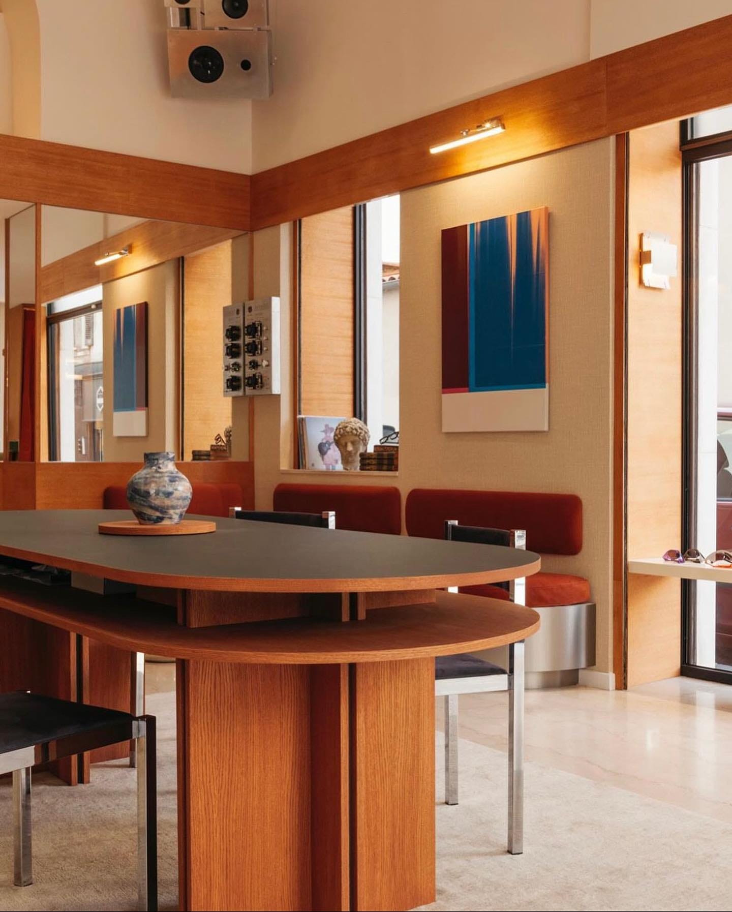
Margaux Fritz Architecture
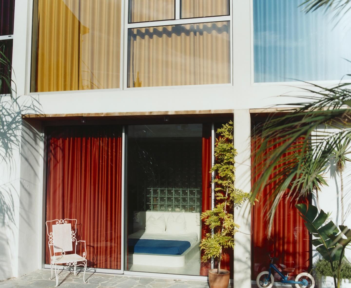
I haven’t had my eyes tested for years ( gulp) and I’m now blaming it on the fact that my opticians doesn’t look like this.
I’m really excited to follow more work by Margaux. Below is an excellent taster. The optician’s I mentioned above and a house she designed, sweetly named villa Bambi. It has the most fantastic curtain choice.
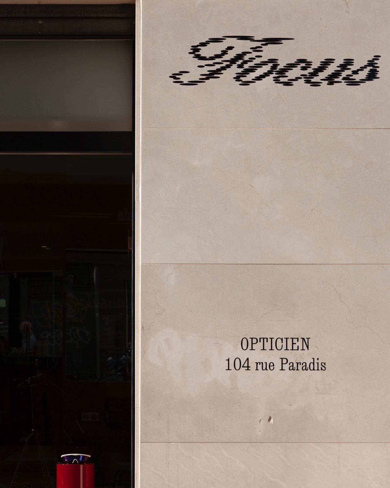
photography @edouardsanville


Villa Bambi
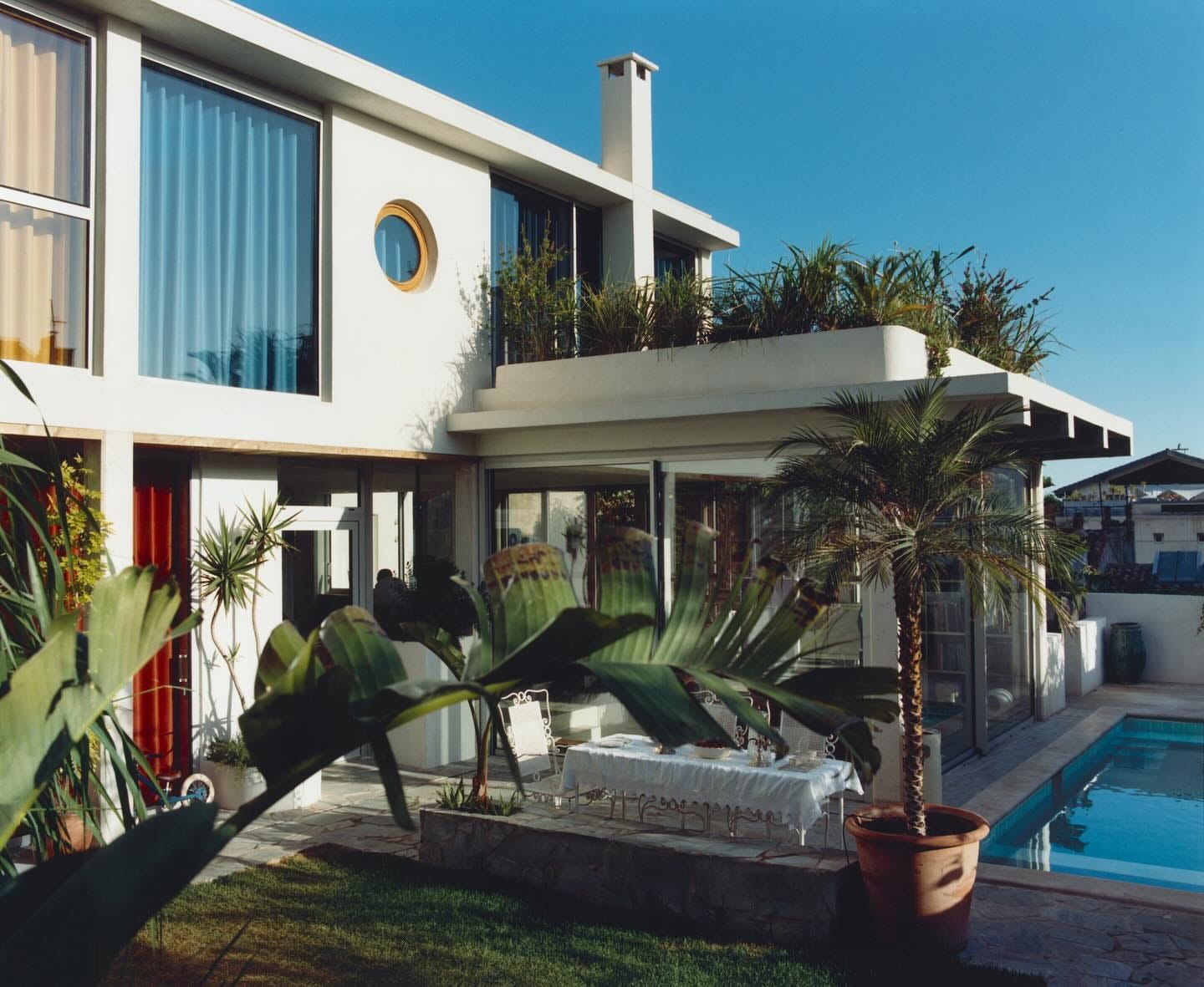
Photography @vincentdesailly
ARCHITECTURE THEN
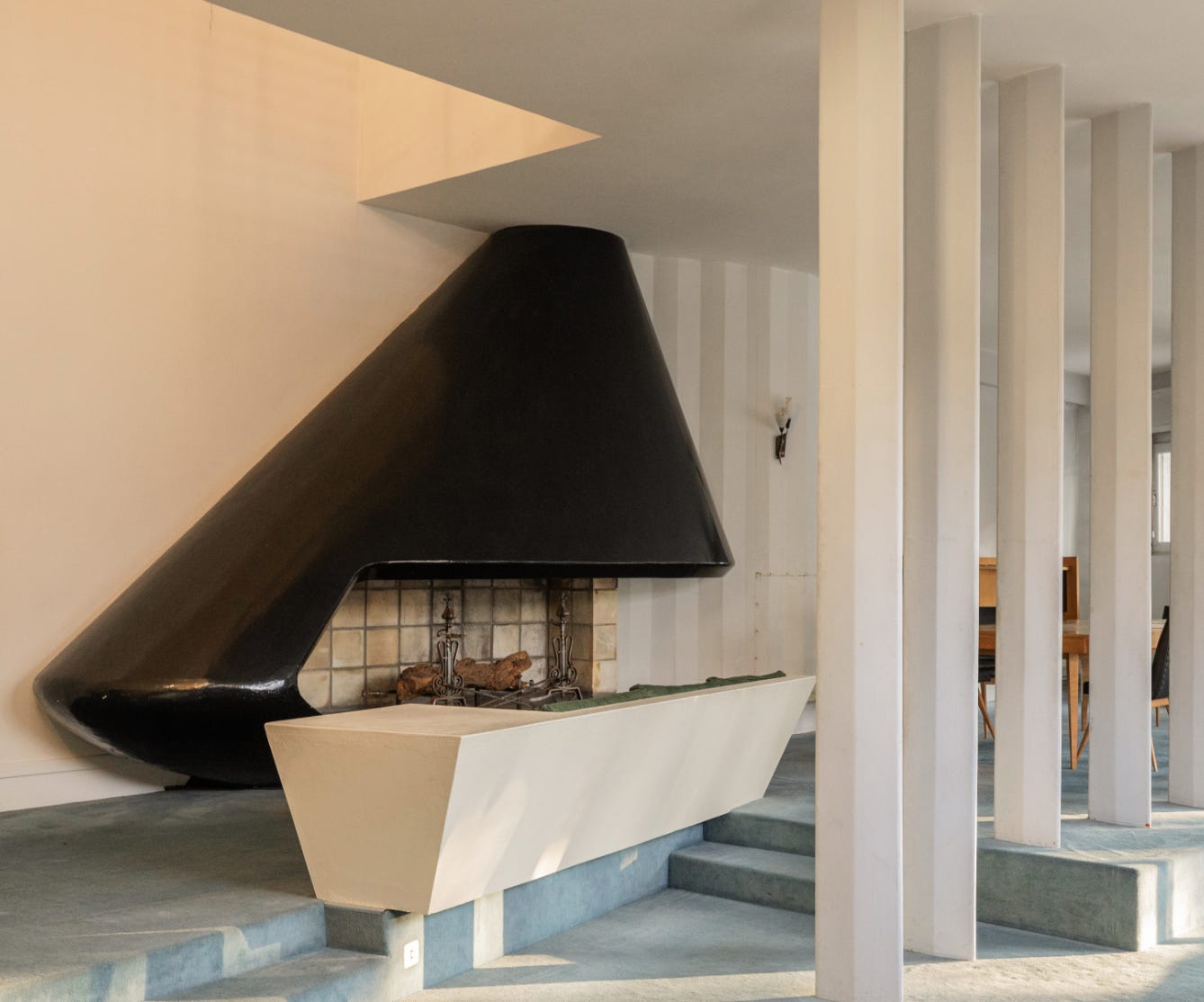
Pierre Marmouget
I found Villa Bambi on a French estate agents called archik.fr . For anyone wanting to up sticks to the south west of France I’ve also found your/my dream home on said site for €850 000. Its by the architect Pierre Marmouget. If you weren’t tempted to click the link above, the fire place below is from the property ..I’m sure I have your attention now.
Villa in Royan by Pierre Marmouget
HOSPITALITY INTERIOR
The Cockatoo at Bistroteque by Nice Projects
Definitely going to treat myself to a Cocktail and some snacks at Cockatoo soon. love the mixture of opulence and utility. The banquettes are great with elegant form and mohair velvet, teamed with castors and polyester grating ..who knew. Also, that fringed ceiling is magical. Nice projects dreamt up something truly special.
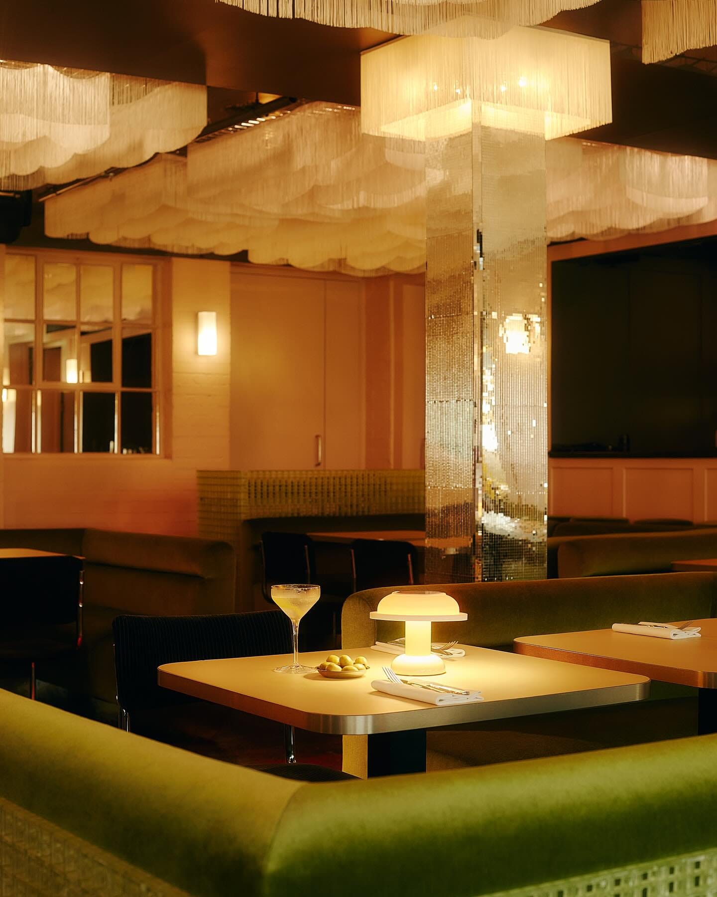
Photography by @studio__hahn


OBJECT NOW
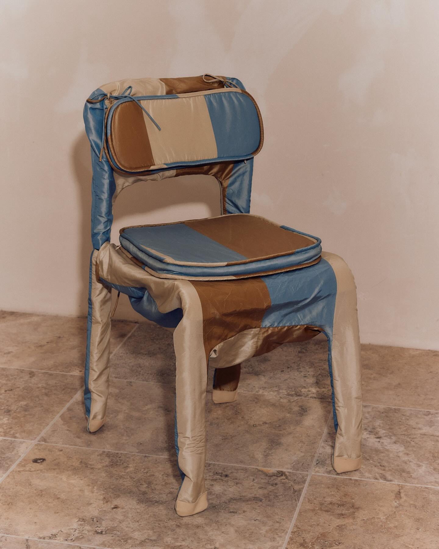
BMDO
You may have already seen the work of BMDO as I discovered it through Site Unseen’s American Hot list. I love when furniture and objects look like they have a story to tell. As a great attribute in people too, I hope to look like I’ve lived my life as well as this chair.
Explore more of BMDO’S great furniture and lighting here
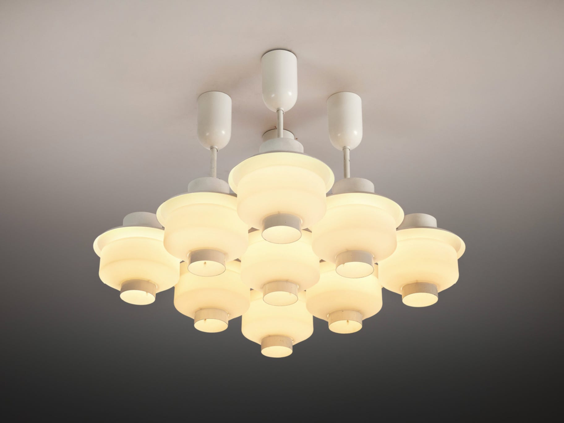
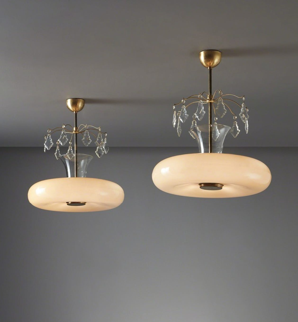
OBJECT THEN
Paavo Tynell
Tynell’s lighting makes me think of a cocktail…perhaps a dirty martini … Delicate but packing a very boozy punch ...with a dash of perfectly weird/aka olive brine.
All imagery from Artsy
This book of his work looks excellent too.


SEE, WATCH, READ, LISTEN
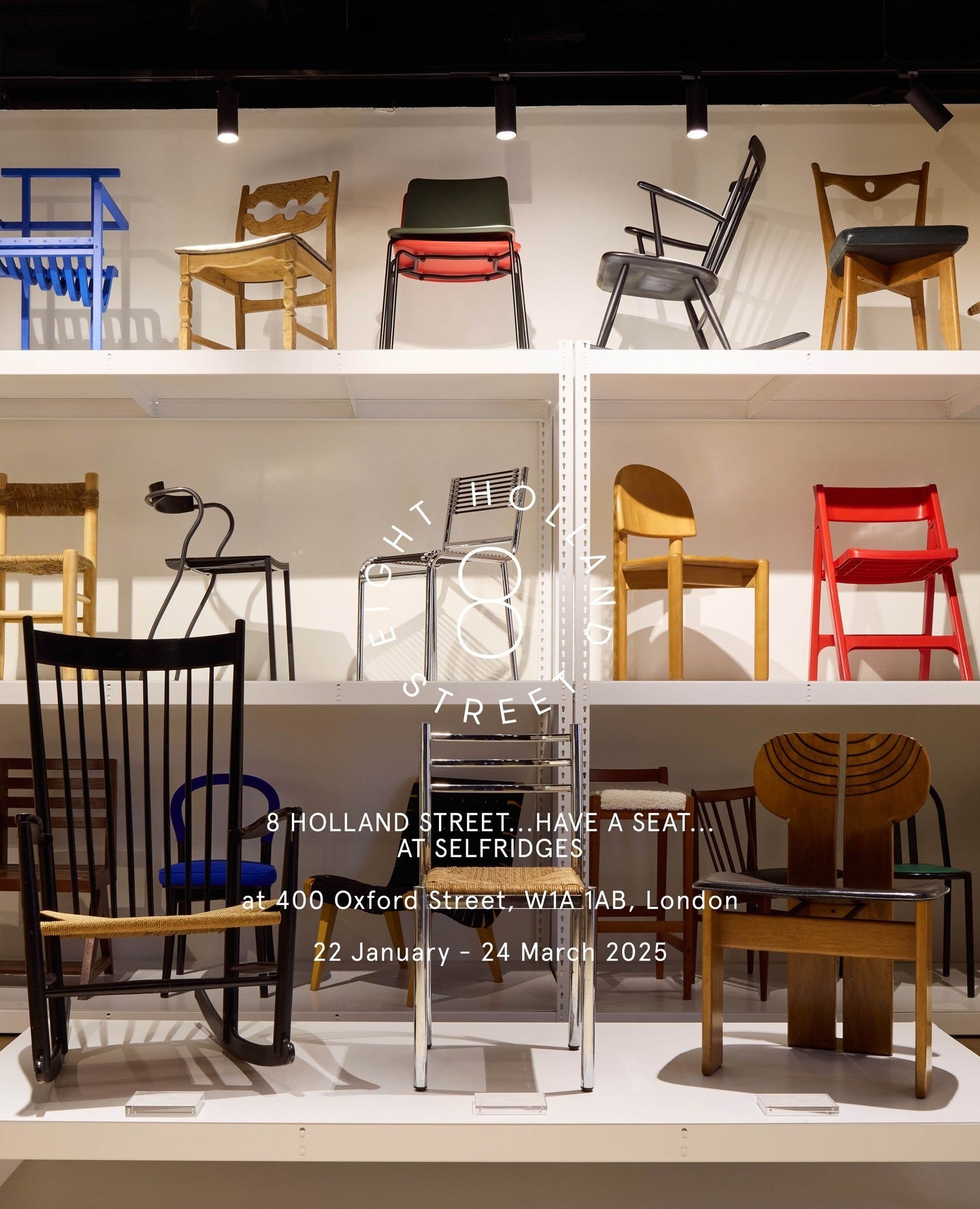
See
8 Holland Street at Selfridges
Presenting 100+ iconic chairs, stools and seating designs, from across the Twentieth Century. Each piece in the collection will be available to purchase in store until the 24th March.
Watch
Touring a Mid-Century London Apartment Brimming with Eclectic Objects on World of Interiors
The Secret Life of Reggie Yates on Modern house
Inside Rita Konig's London House
Read
I enjoyed reading this interview with interior designer Tiffany Duggan of Studio Duggan on Kate Watson Smyth’s MAD ABOUT THE HOUSE Substack House Notes #7 ..also grateful for the hand cream recommendation.
&
Cola Studio’s Substack - Cola Index - January '25
Listen
Faye Toogood on the whitewall podcast
Nick Cave on the Fashion Neurosis podcast with Bella Freud
Sarah Pascoe on Young Again with Kirsty Young
Self Esteem on Comfort Eating with Grace Dent.
Writer Nathalie Olah on 'Bad Taste', Consumerism as Identity, Seeking Beauty in an Ugly World on Deep Read with Phoebe Lovatt . I Hesitated to post this as someone who ‘curates’ a newsletter, but its a fascinating conversation that has basically opened a can of worms in my head ..never a bad thing.
Elsa Schiaparelli: Where Fashion and Surrealism Began (w/ Darrian Wright) on Women Designers You Should Know
If you enjoyed this post please do give the heart a tap or re-stack, it means the world!
I’ll see all paid subscribers later in the month for Best in Show and Field notes and the rest of you in March, yay, spring is close.
Em
x
I lost myself in this post. So MANY interesting and beautiful things to click on! Thank you.